Never Dust The Windowsill
I remember an old comic strip where the character starts by dusting a windowsill, and gradually notices other things requiring attention. The punch line was that when all was said and done she had ended up repainting her whole kitchen. That's how I feel about this whole blog redesign. I started by realising that if I stared at the miles of white space any longer I'd have to prop my eyes open with bottlecaps. So I switched to a pretty green thing. Then I realised that my eyes are getting too old to read reverse-out text comfortably. (Bifocals here I come.) One thing led to another, and here I am with a whole new template of my own design. If by "own" design, you mean a broadly-pillaged Douglas Bowman creation, that is.
Some trivia:
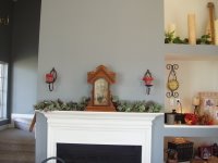
• The colors now match my living room.


This was honestly unintentional. But I suppose it's a firm testimony to how much I like the gray-purple-green combination. It's soothing and looks (to my eye at least) both understated and luxurious. And I think perhaps I've devolved to writing marketing copy again.
•The infamous chocolate vine is featured in the header graphic. I figured I could enjoy the purple blossoms for awhile, since they're gone from the vine after only two weeks.
•I've been designing catalogs, Powerpoints, business plans and product packaging for about six years now. This is the first time I've done a website for myself in seven years. It's eerie how similar it is to what I do already.
•I tried to figure out a way to feature my dogs or some other thing, but it just ended up looking really amateurish. Not that this doesn't. But it was EVEN MORE so. Which is to say "bad."
•I haven't read anything in book form for a day and half. That's weird. But not as weird as the fact that I paid 99cents for a Rodger Hodgson solo tune on iTunes. It's a good song, but I sometimes wonder about myself. (The only thing this has to do with this new template is that it just came on the shuffle play.)


11 Comments:
I like the new look!
keep meaning to ask--what DO the words in your header mean??
I really like the new blog design!! Easy on the reader's eyes.
It's lovely, ma'am. So peaceful. So fitting.
And, when you're on a good rant, ironic! Hee!
I like this design a lot better than the green. I'm with you on the reverse text.
I like it, too. You're right about the luxurious feel. Very nice.
It was a For Better or For Worse - Elly cleans the sill and then decides to do the window and they takes down the curtains to wash and Michael comes in (although it could have been Elizabether) and asks what she's doing and she says "Wishing I'd never washed the windowsill!"
I pictured it immediately, and I know you're a fellow fan. When I come across it next, I'll scan it and send it to you.
Now I'm going back to read the rest of the post. :)
Ditto what the others say.
keep meaning to ask--what DO the words in your header mean??
Amy, it's a long story. I'll write a post about it. I've been meaning to for a while now.
It was a For Better or For Worse - Elly cleans the sill and then decides to do the window and they takes down the curtains to wash and Michael comes in (although it could have been Elizabether) and asks what she's doing and she says "Wishing I'd never washed the windowsill!"
Jag, I was 99.9% it was FBOFW, and was tempted to dig through the archives for linking. But then I was too lazy. ;-p And I've obviously remembered it wrong, but leave it to my memory to exaggerate the fourth panel...
And yes, I'm a HUGE FBOFW fan.
I really like the new blog design!! Easy on the reader's eyes.
Thanks, Cheryl. And for the record I was NOT slamming you for having your dogs on your site. Your design is VERY professional. I just couldn't work the same magic over here.
And thanks everyone for being reaffirming of my late-night tinkering.
Don't waste your time going through the archives...it's not in any of the time travel pages, but I swear I'll find it and send it to you.
I'm glad to find a kindred soul in FBOFW land.
Like the new look! So impressed that you did it yourself! (That's not some sort of backhanded compliment, I sincerely mean it because I have no idea how I would redesign my website.)
Post a Comment
<< Home