Business Cards & Letterhead
I rarely write about my work because, well, who cares? Work is work. But this is important, so I'm going to step away from the chitchat and speak from the heart.
If you want a good business card or office stationery, make sure the person designing it was once an assistant.
Or secretary. Or Administrative Professional. Or whatever you want to call those of us who know where the bodies are buried, who you have to call to get the copier fixed and what time the UPS man picks up from the lobby. In the world of visual overload, graphic designers like me are a dime a dozen. Photoshop & Quark have been the great equalizer--turning the painstaking process of prepress into a no-brainer. Now everyone who hangs out at Fark.com can call themselves a Graphic Designer. And that's a good thing, I guess. Except when they're designing business cards and letterhead. Why? Because when an artist gets his hands on any blank canvas, it becomes a forum for his creativity. And while it may be cute as all heckfire (sorry, Tim W.), it makes for a lousy business card. I can't count the number of cards I've thrown in the trash because the cute picture of an oceanliner (Suzanne Cruise Creative Agency) or artist's palette (more artists than I can count) obscured any useful information. LIke the person's phone number.
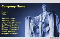
See, the people who keep the business cards AND USE THEM are not your peers in the industry. They are the secretaries and the housewives who will use your services. They don't care if you have a photo of the Lincoln Memorial.
 They want to know how to reach you. Period. So make sure you have your name, your address, your phone #, your fax #, your email and your website. That's it. Make sure they're clearly printed and easily read. If you can get all that on there and still have room for a tiny logo, go for it. And never, under any circumstances, use the Comic Sans font. That will forever be the Beanie Baby font, and communicates to the entire world that you have no business having your own business.
Oh, and one other thing. Paper. The best way to make sure that people keep your card is to make them feel a part of the card. So print your card on a paperstock that will allow people to write notes on the back. It may seem cute to have a business card that's "just like a credit card", but in the long run people will chuck it. Same with magnetic cards. Unless you deliver pizza, magnetic cards won't get kept.


6 Comments:
I have noticed in my few freelance design gigs that clients don't always go for simplicity. Many will see the rationality, but someone in a high position with their hearts set on Lincoln or a cruise ship will make quite themselves quite the obstacle. Designing for a committee is the worst.
Comic Sans is so 1998.
Hi Katherine,
These are great tips; thanks for sharing them.
It scares me how many otherwise professional people have given me cards that were obviously printed by them on their own $70 inkjet printer at home. Furthermore, the cards themselves tend to use about seven different typefaces (with different colors, natch), lots-o-borders, fills, and graphics, and never cease to make me feel a little queasy around the edges after viewing them.
Wow. Blessed simplicity! (And relying upon design/content experts for help.)
Thanks,
Tim
Great tips! Thanks!
We are studying this in my design class this semester. I'll be sure to share this with the class.
It is where your unique branding can speak the best, alongside all your company’s correspondences. All your other print collaterals should complement your letterhead design to create a solid and consistent identity, with style.
A letterhead is the heading at the top of a sheet of letter paper. That heading usually consists of a name and an address, and a logo or corporate design, and sometimes a background pattern.
Post a Comment
<< Home